It’s fascinating to me how different dolls are depending on their intended audience. Not just their style, anatomy, or thematic accessories—that is, diegetic aspects of the role-playing. I mean the mechanical decisions. The intended ways of playing, and how they’re communicated through pieces of plastic. In general, dolls branded for girls are stiff—they can move their arms and legs at best, and handheld accessories look uncanny in their ever rigid hands. Dolls branded for boys tend to have plenty of articulations and physical possibilities. Boys dolls are agents. Girls dolls are objects. Ones do the things, the others have the things done to them.
It’s only normal, considering history: dollhouses were born as emblems of wealth to be exposed, as well as didactic simulacra of domestic life for little girls. These famous dollhouses, albeit luxurious and detailed, had boring to death structures. They were cupboards with many rectangular rooms, all symmetrical to each other. No sense of transition or depth* at all. I mean, I like classic dollhouses, but if I had to choose, I’d go for something like Polly Pocket.
Watch this.
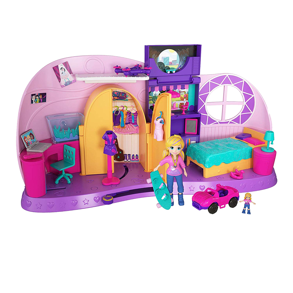
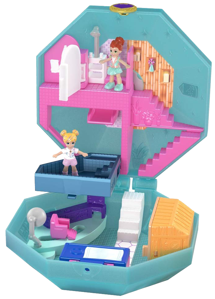
This is one of the latest Polly Pocket products and sure, it seems different from the original toy. But it isn’t. Polly Pocket has always been about evoking a dimensionality other dollhouses couldn’t have. They were the size and form of a makeup kit, and when you opened them, one half would be perpendicular to the other, thus conveying horizontality and verticality simultaneously.

This toy goes a step further: it attempts to represent depth through “pocket” Polly’s world. Big Polly’s room seems normal until you pull the lever. At that moment, the big doll hides in the closet and the small one comes out of a shelf, implying a transformation akin to Alice’s. Opening a cabinet will reveal a window from which you can see a small—that means far away—half-pipe. Now that Polly is tiny, she can “go there” to show off her skating prowess! Barbie’s dollhouses can’t achieve this flexibility because they’re made for dolls that are too big. Their proportions are realistic and absurd at the same time. Here, however, the sense of depth and transition are fictional and creative; they expand the narrative territory of play and enable a resonant identification with the avatar.
Polly Pocket can only stand or sit, but her plasticity is endless.
*The classic dollhouse problem—they’re 2D in practice—has been acknowledged by yet another Mattel product: Pixel Chix. They put the furniture inside a house and used a screen to project the doll onto it.


